Friday by Dailypay

What it was

DailyPay, the leader in earned wage access, wanted to build a new app that would offer earned wage access for free, and bundle it with best in class neo-banking features.

Why we did it

Relieve our users of the biggest friction point - transfers fees. Retain DailyPay users post job termination.

What I did

As the Lead Product Designer and Design Manager, I designed the app from the ground up, including UX research, UI design, user testing, brand design, debit card design, and the beginnings of a component library and design system. I also managed one product designer on the project.

What the results were

After launching this new app we achieved …

  • Recognition in Fast Company’s World Changing Ideas Awards for 2023, for its role in reshaping access to pay and financial wellness.

  • 4.9 stars on the App Store

  • 66% enrollment rate (greatly surpassing our goal metric)

  • 45% direct deposit switch rate (meeting our goal metric)

Overview

Full case study on request

Full case study on request

Full case study on request

Designing the card

Designing the card

To ensure compliance with Visa’s design guidelines, I brought on a contractor to help navigate brand and production requirements. Through several design iterations, we chose a clean white card with a minimal logo, balancing Visa standards with manufacturing constraints. This simplified approach allowed us to move quickly for the pilot while preserving flexibility for future brand evolution.

To ensure compliance with Visa’s design guidelines, I brought on a contractor to help navigate brand and production requirements. Through several design iterations, we chose a clean white card with a minimal logo, balancing Visa standards with manufacturing constraints. This simplified approach allowed us to move quickly for the pilot while preserving flexibility for future brand evolution.

High level journey

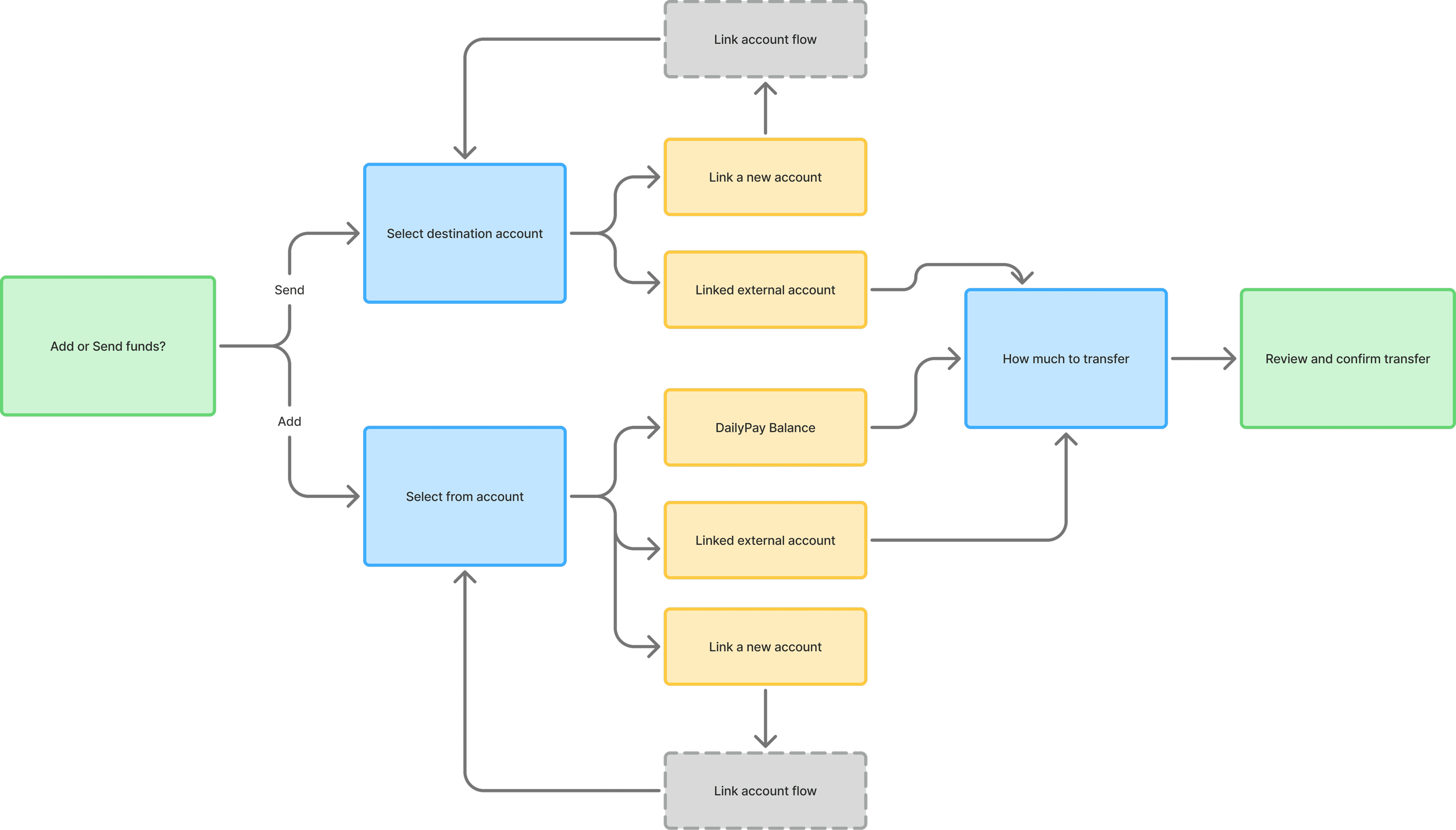
As a 0-1 project I started by wire framing the high level user journeys which included a card opening flow, a direct deposit enrollment flow, and a money transfer flow. This is a snapshot of the main user journey for the MVP.

User testing

User testing

User testing

I tested the first concepts by having users run through the main user journey of signing up, opening the card, enrolling in direct deposit, and making a transfer. This testing proved very valuable as it highlighted points of confusion and opportunities for better engagement.

I tested the first concepts by having users run through the main user journey of signing up, opening the card, enrolling in direct deposit, and making a transfer. This testing proved very valuable as it highlighted points of confusion and opportunities for better engagement.

I tested the first concepts by having users run through the main user journey of signing up, opening the card, enrolling in direct deposit, and making a transfer. This testing proved very valuable as it highlighted points of confusion and opportunities for better engagement.

Optimization

Optimization

Optimization

During onboarding, I noticed users were skimming past dense blocks of text and missing the core value of the product. To address this, I introduced moments of visual delight that helped draw attention and make the experience feel lighter and more approachable.

Because the MVP had a single, primary value proposition, I intentionally used an automatic horizontal scroll to de-emphasize secondary content—reducing cognitive overload while subtly signaling that there was more to explore as the product evolved.

Direct deposit legal & language

Direct deposit legal & language

Direct deposit legal & language

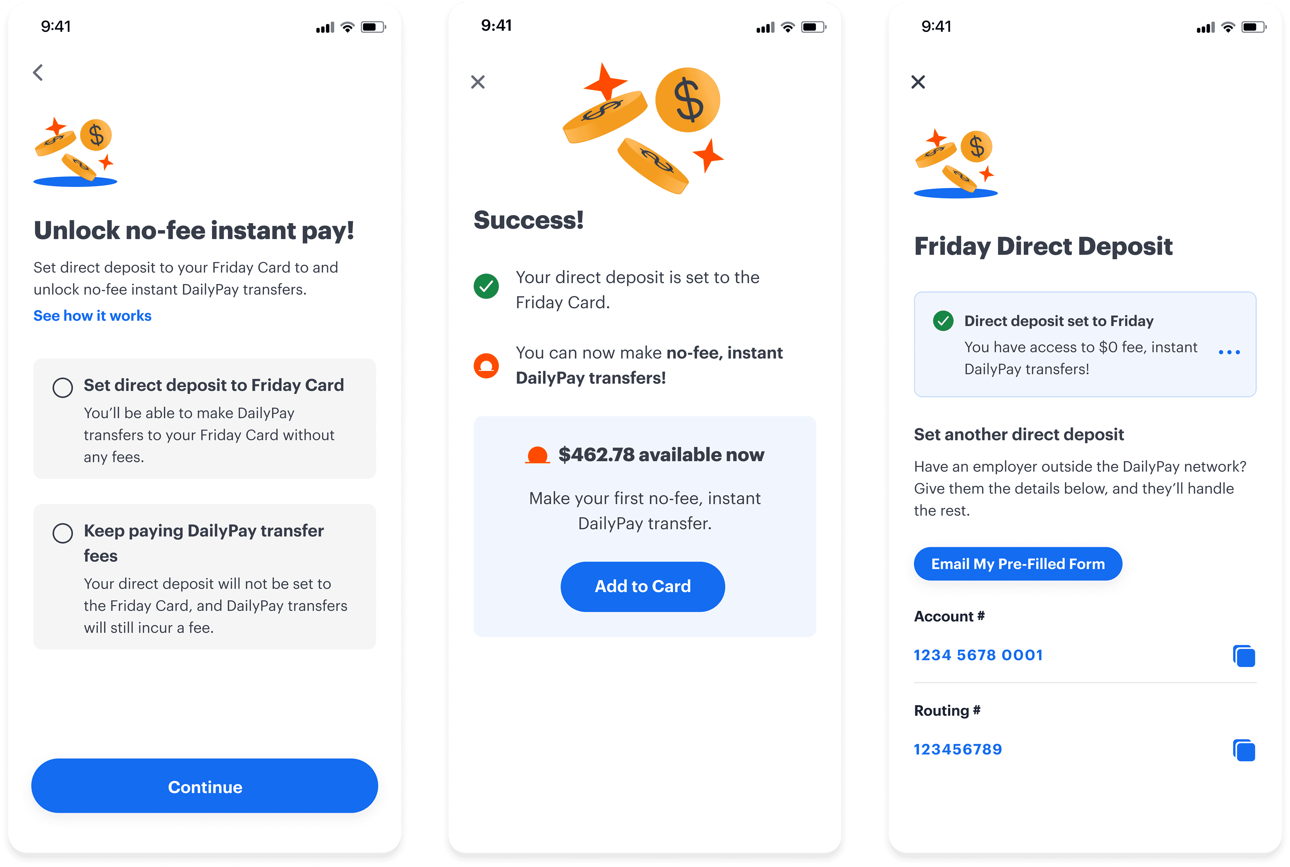
I partnered closely with Legal to refine the direct deposit language. To resolve misalignment, I led user testing to evaluate comprehension across proposed options. The findings showed that legally preferred phrasing was not only confusing, but perceived by users as misleading—creating a sense of being “tricked” into an action they didn’t intend. These insights enabled the team to align on clearer, user-centered language that met both legal and usability needs.

Rethinking the transfer flow

Rethinking the transfer flow

Rethinking the transfer flow

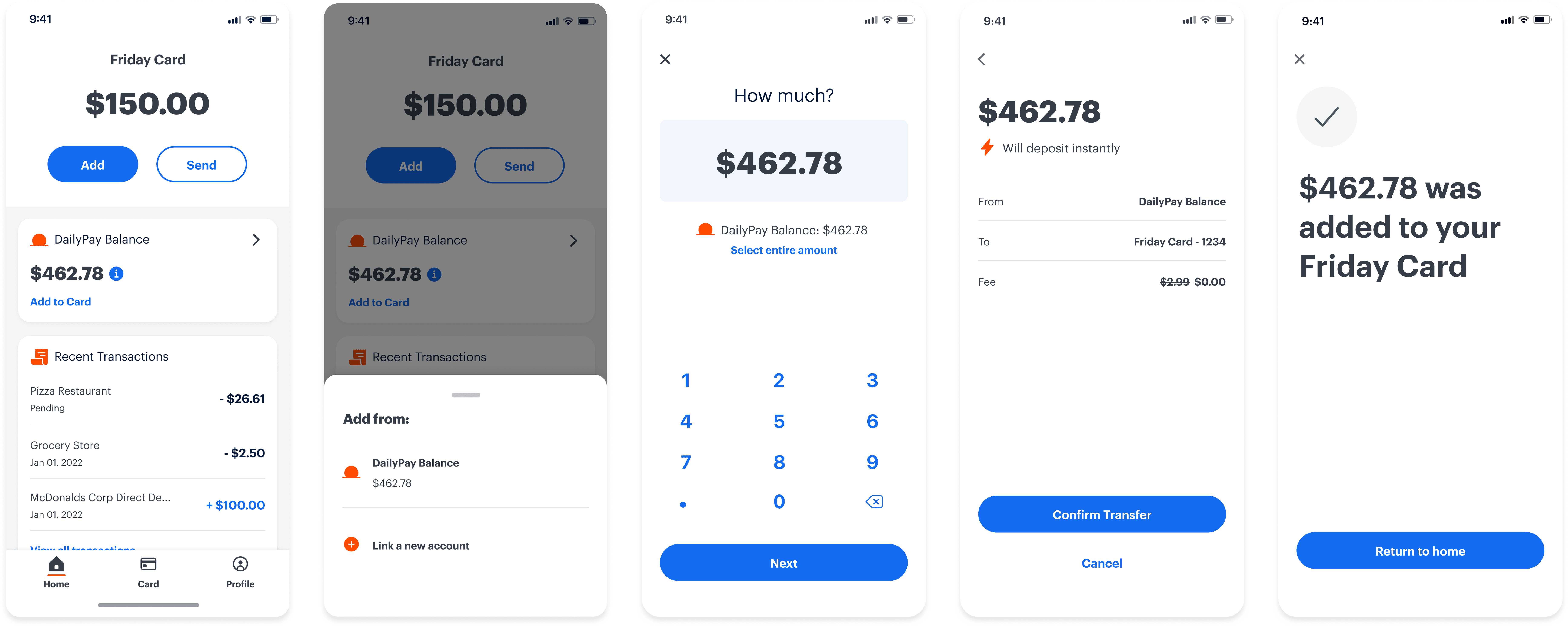
Partnering with my product manager and engineer, we identified that the existing transfer flow was not scalable and introduced unnecessary user friction. We redesigned the experience by bifurcating it into distinct “Send” and “Add” flows—simplifying the mental model, improving scalability, and aligning with familiar patterns users already understood from comparable products.

Transaction interaction prototyping

Transaction interaction prototyping

Icons & theme exploration

Icons & theme exploration