Bread - unified application
What it was
Bread was one of the first players in the Buy Now, Pay Later space, that took a merchant-first approach (compared to our D2C competitors). After being acquired by Alliance Data Systems, a retail credit card provider, leadership wanted to explore the opportunity for consumers to apply for all lending products at once (Bread Installments, Bread SplitPay, and Credit Card)
Why we did it
Provide merchants an all-in-one payment lending solution that not only captures and converts more consumers, but also provides upsell opportunities that increase profitability.
What I did
Lead designer for the project where responsibilities included UX research, design, and strategy.
Challenges
Does presenting all three products create a "paradox of choice" situation, and/or are users able to effectively compare their options in order to select the payment product that is best for them?
The End Product
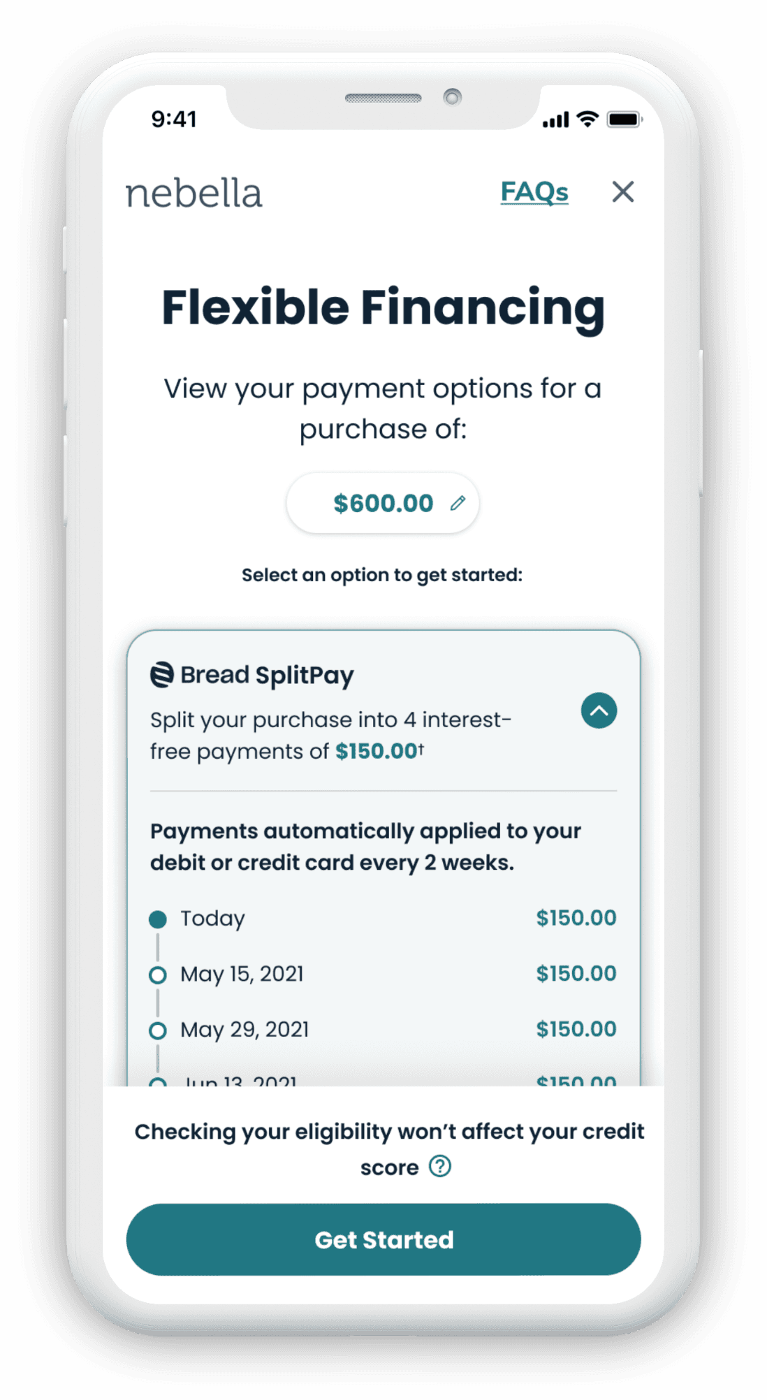
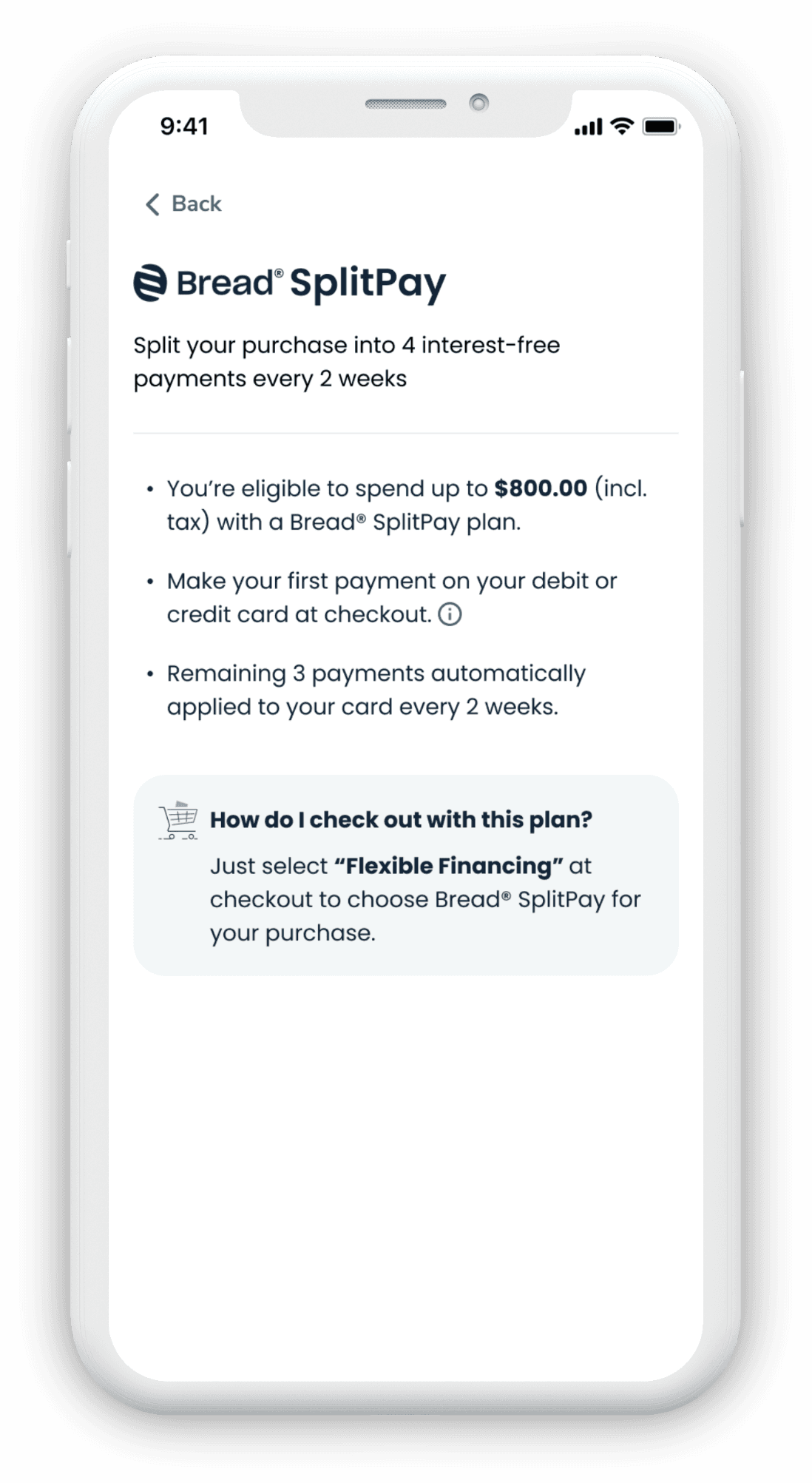
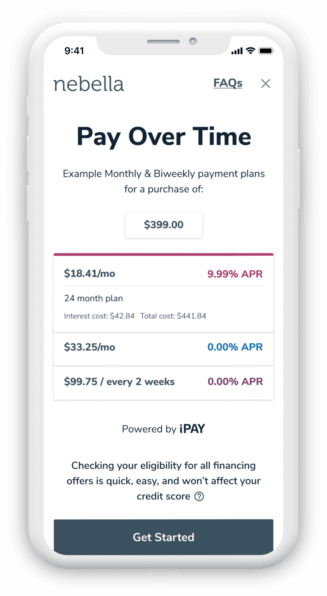
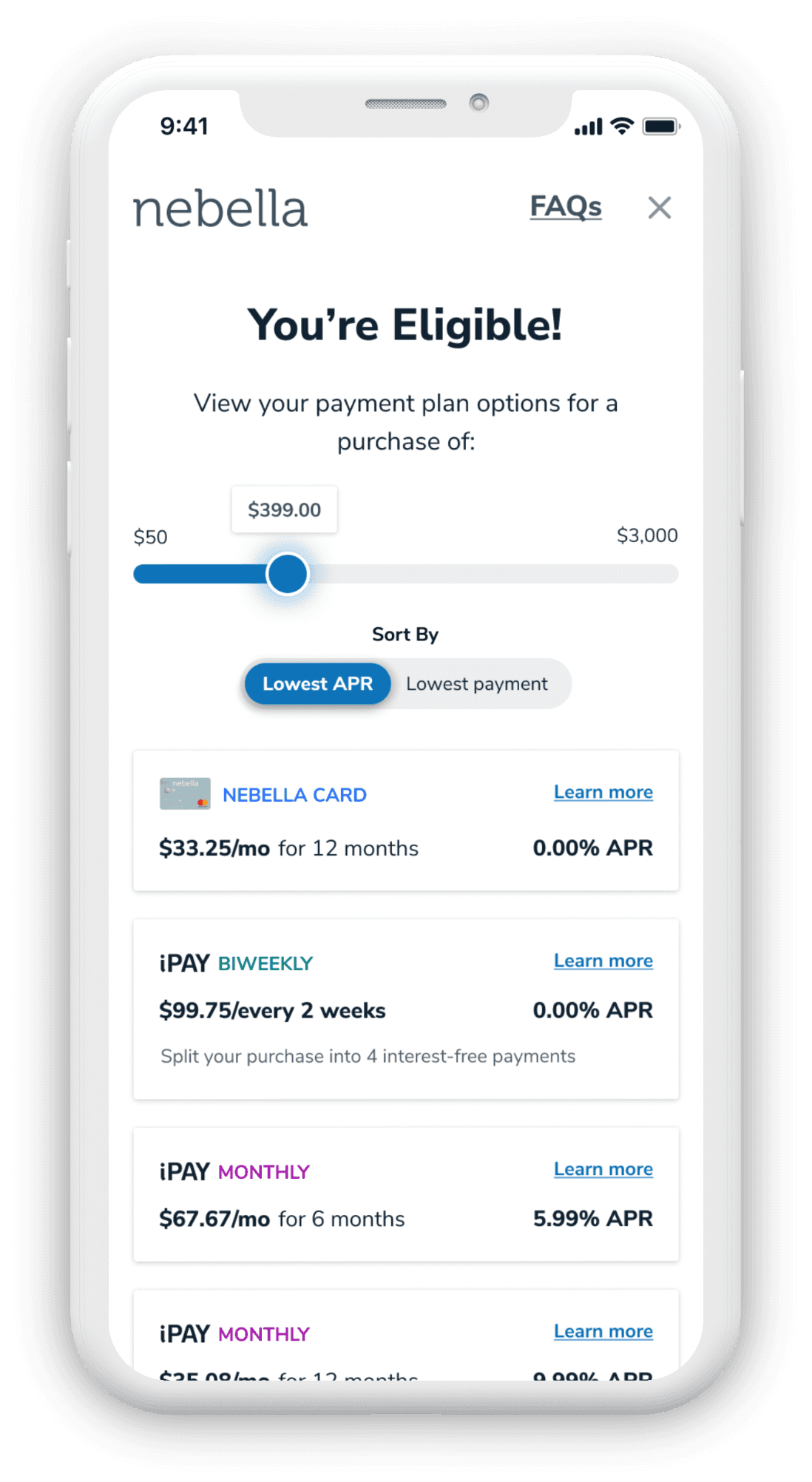
Before getting into the process, here's a taste of some of the final screens:
Opportunity Mapping
I mapped out the opportunities to convert a Bread user to a Card user for 3 different archetypes.
Path Exploration by Merchant AOV
High AOV merchants typically offer a card with special financing, low AOV merchants offer a card with Rewards. I worked through the ways these two kinds of cards could be displayed alongside a Bread product that stayed aligned with a shoppers intent.
User Flows
What scenarios could lead the users down different paths?
Initial Insight Testing
I wanted to get some initial insights into what people think when they see two options for financing side by side? Are they confused? Do they think they're the same? Do they gravitate towards one or the other?
Insights:
We learned that Bread was the gateway to the card
Highlighting that the pay-over-time option is provided by a 3rd party reduced the confusion over whether or not the card and the pay-over-time product were the same thing.
Even though "iPAY" is more expensive, it still attracts consumers because it doesn’t come with the commitment of a credit card
Remove Card Bias
The business wanted to drive more users to their credit card, and with a 0% APR offer I wondered how we could get users to view the card in a better light. How can we get users to see that even though they are different ways of financing, in the end they provide the same service? That in the end the card (in most cases) offers the better APR?
"The mere act of classification reinforces stereotypes. If you want to weaken some stereotype, eliminate the classification."
-Michael Lewis, "The Undoing Project"
Initial Concept Testing
I designed and tested some concepts that showcased the products more as options of the same thing, rather than two separate and distinct choices.
The payment plans displayed are product agnostic, since after all Bread and Card financing technically both offer monthly payments. The presentation of the offers was designed in a way to not bias the customer going into the flow. Once presented with their offers, we can make the card product stand out by highlighting it's 0% APR advantage.
Legal & Compliance
Our conversations with the L&C teams made it clear we couldn’t blur the lines between what is a card product and what is Bread on the intro, and presenting monthly payments and APR in a comparative fashion would cause issues with UDAAP.
So we did a quick pivot:
I took what I learned and tried to adapt it to a new concept. We knew that if we have to display the products as separate, we should clearly display Bread as the 3rd party provider, and we can still strive for parity between the products using similar UI constructs.
The Final Concept
Our research showed that we needed an intro page that would change dynamically based on the call to action the user clicked. The offers screen that was presented after the application also took on this behavior, based on what option the user selected on the intro screen.


