Bread - checkout redesign
What it was
Bread, a merchant-first pay-over-time solution, allowed online retail stores to quickly add merchant branded buy now, pay later options to their checkout experiences. I worked on the consumer facing checkout experience that was embedded in online retail checkout flows.
Why we did it
The company was undergoing an overhaul to create Bread 2.0. The business wanted to take this opportunity to optimize our checkout experience for our Bread Direct merchants and business partnerships.
What I did
Lead designer for the project owning all of UX research, design, and usability testing.
Challenges
Designing a scalable solution that provides a range of white labeling customizations from Bread Direct to Enterprise. Emerging partners want divergent experiences and capabilities which impede on scalability.
Goals
Standardize
Standardize our flows and merchant customization offerings in order to scale more efficiently.
Optimize
A cleaner & more engaging UI to improve the user experience, elicit trust, & demonstrate to merchants the value Bread puts into research, design & engineering.
Convert
Improve conversion through a more clear, transparent and efficient application process.
Sell
Improve SMB merchant sales by showcasing the most seamless, user-friendly checkout flow. Improve Enterprise sales by showcasing the most customizable checkout flow that builds upon their brand.
Design Audit
I uncovered all the different screens, flows, edge cases, and inconsistencies within our current experience. I presented it all on a wall so we could see the state of checkout in one view.
Data Analysis
We analyzed the data we had on our checkout experience, like our checkout conversion funnel, Looker data (element click, rage clicks etc), results from our previous A/B tests and more.
Data not shown; under NDA
Customer demographics
We looked at the data we had on our current customer base.
Data not shown; under NDA
User Research
I conducted all the user research for this project which included:
33 User Interviews (non Bread users, Bread users and Bread abandoned users).
Multiple rounds of usability testing to get feedback on our current flow, competitor flows, and early concepts.
Taking part in interviewing some of our merchants
Surveying around 200 customers.
Research Findings
It's easy & transparent
Trust is key
People don't know what Bread is
Our user flows need work
More context is needed
Archetypes
Based on the user research I was able to create "Pay Over Time" archetypes (I went for a "The Big Short" theme)
Journey Maps
Whitelabeling vs Customization
The company always referred to its product as a white labeled solution, but this was never true. The customer will find out who the financing provider is post checkout, and this is a source of confusion for users. I pushed for a new strategy that was based on tiered customization vs white labeling.
Tier 1
Tier 2
Final Designs
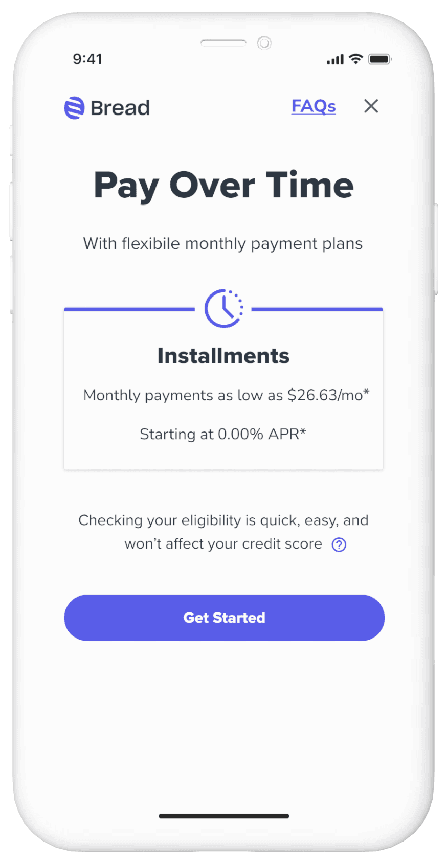
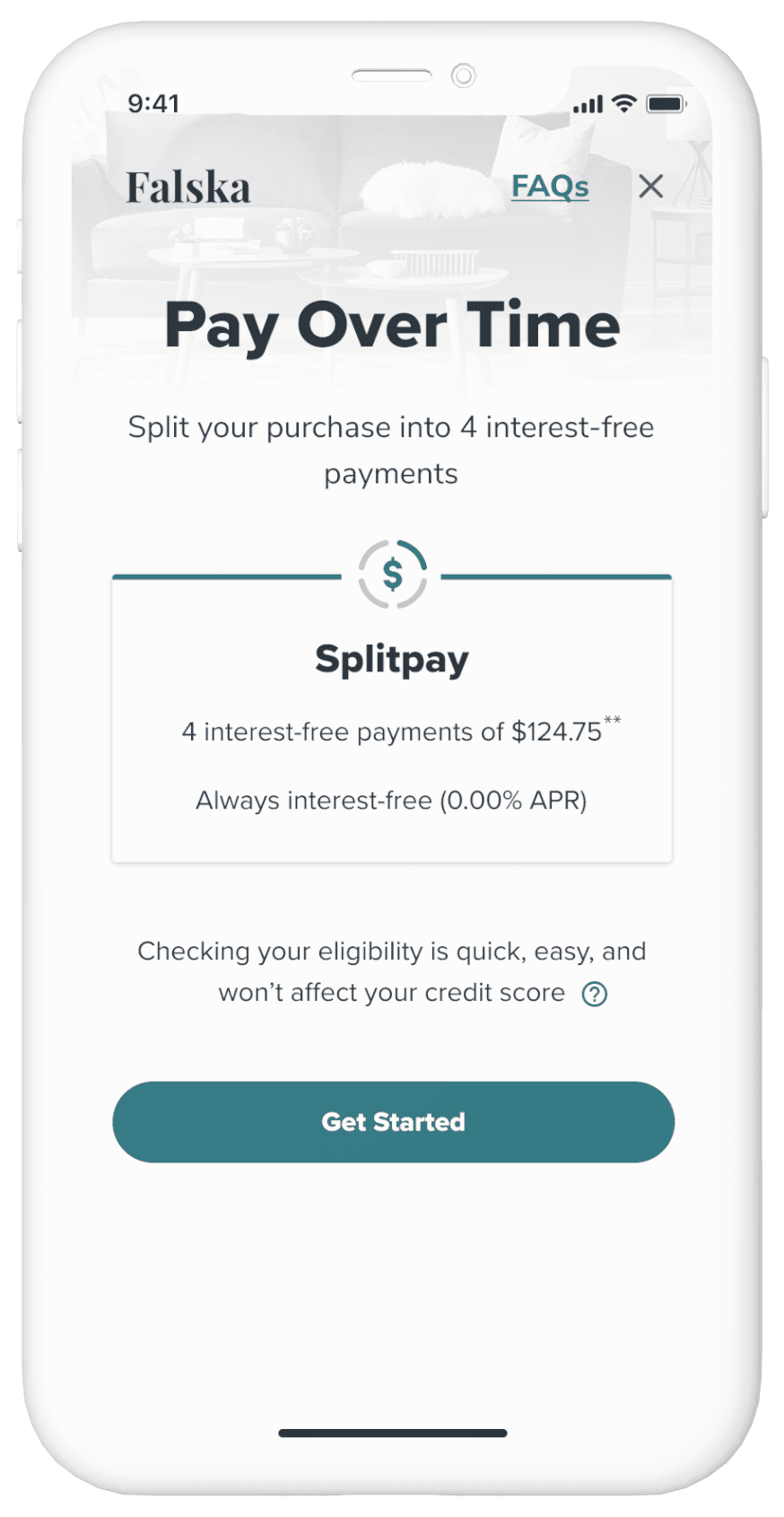
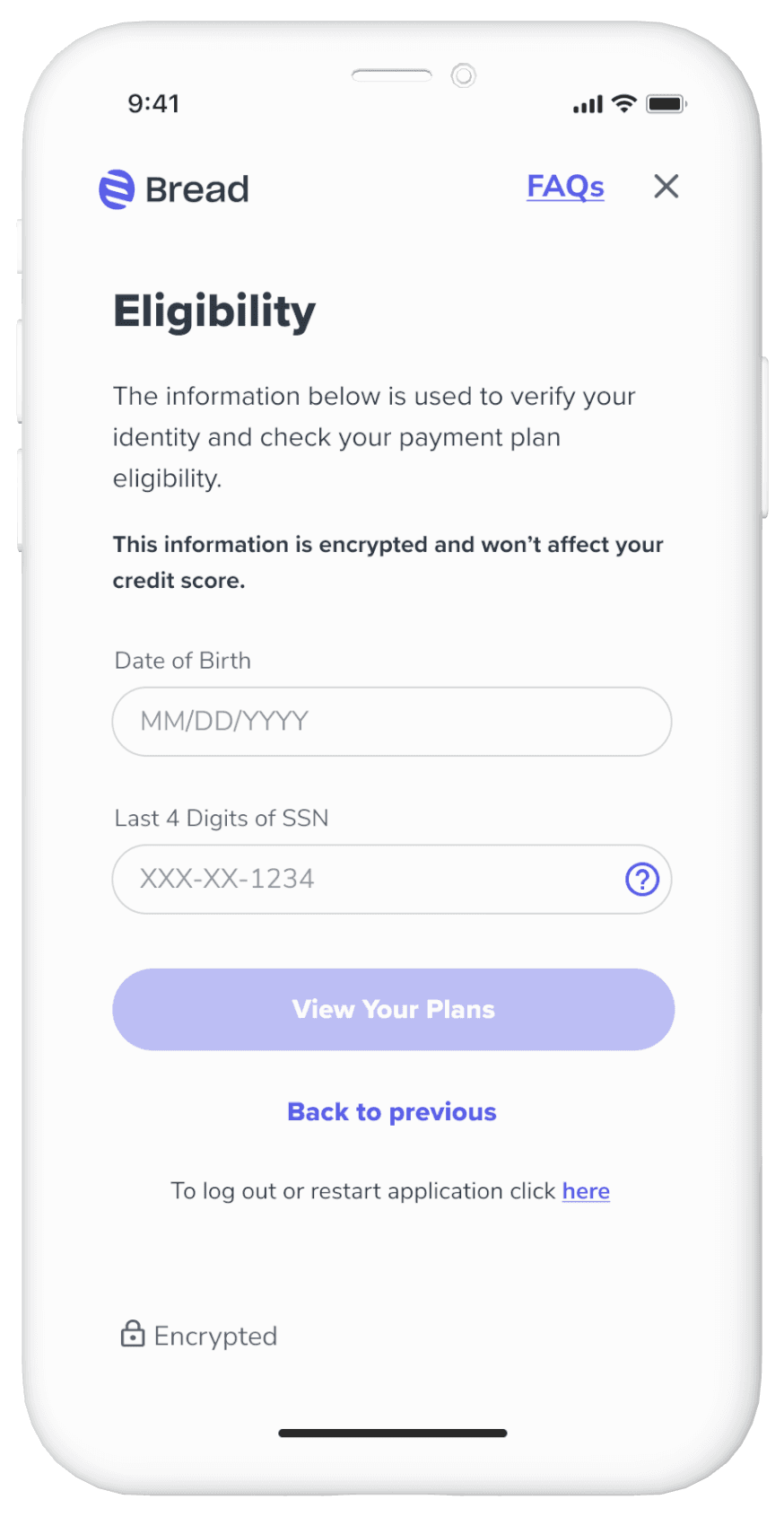
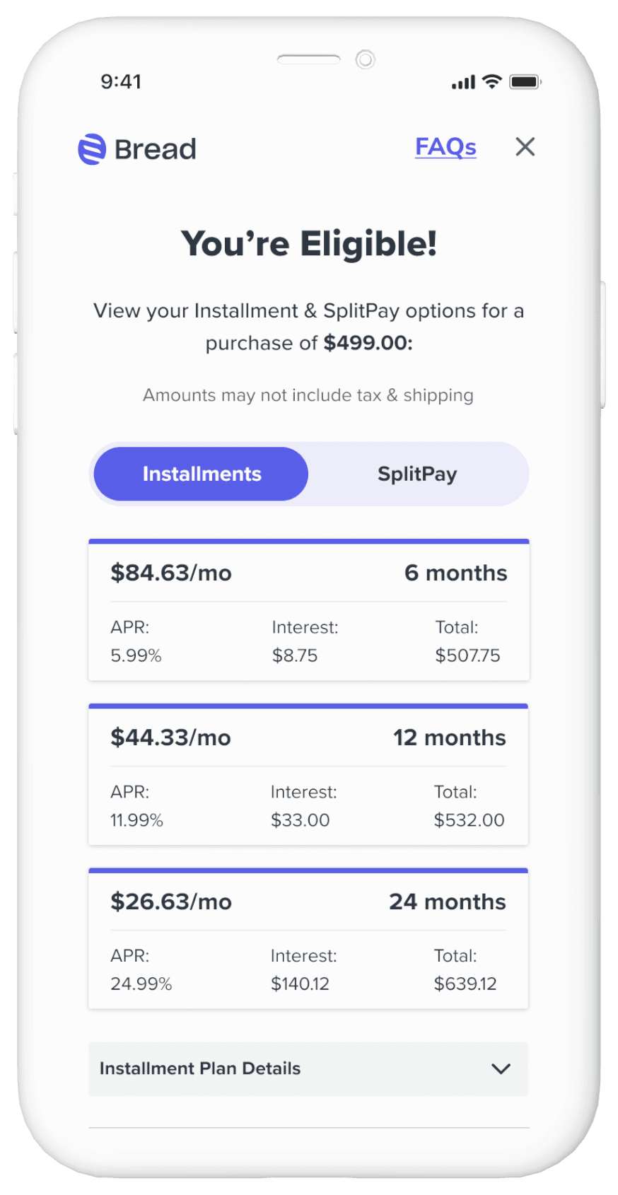
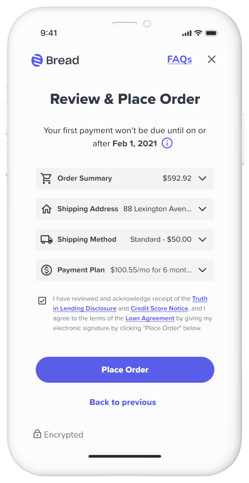
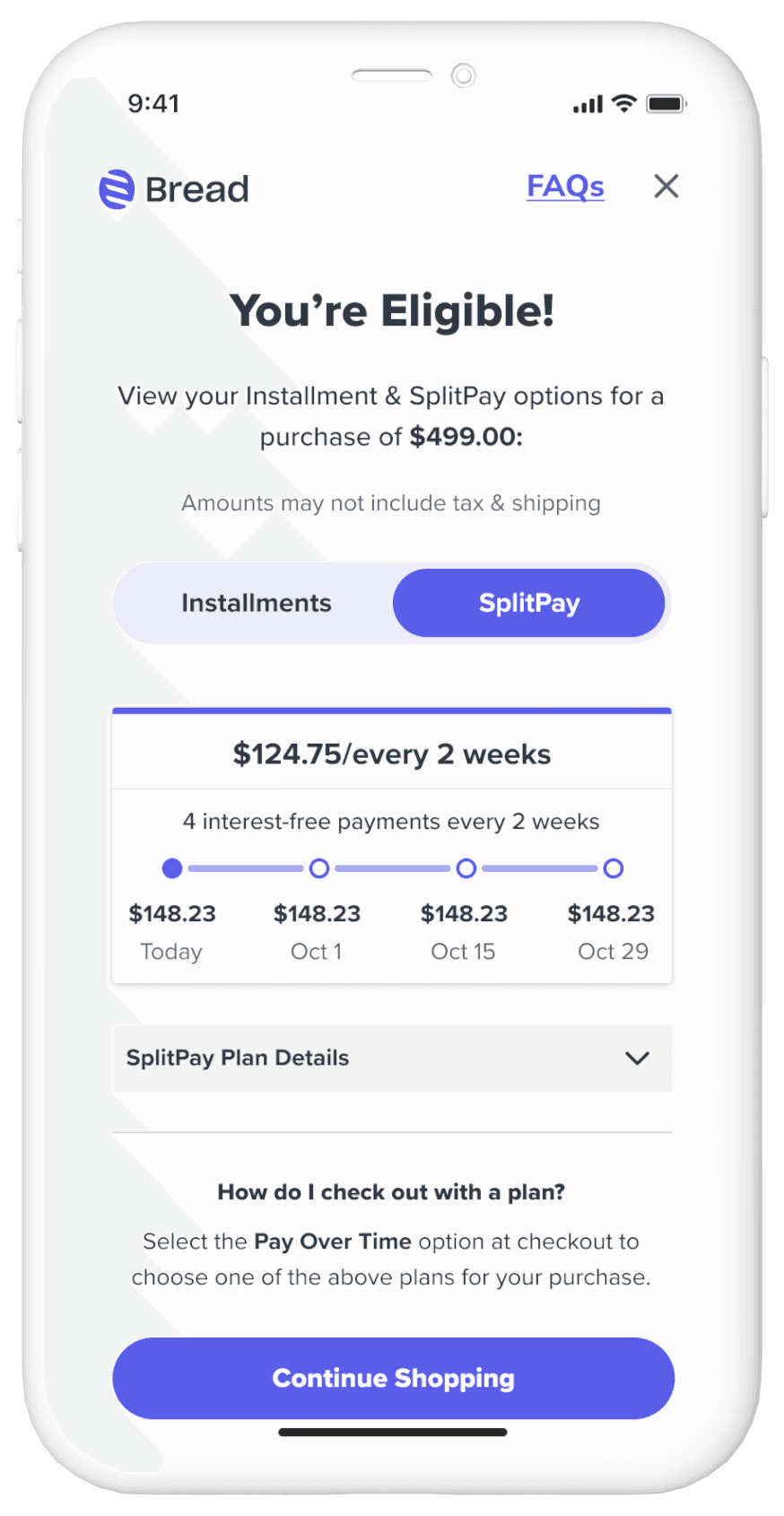
After multiple rounds of testing where we found that copy was the main aspect that needed iteration to provide clarity to the user and elicit trust, we landed on the below MVP screens. This was a very de-scoped MVP experience. Nothing was final, and there was a lot to continue to iterate on.
Deceivingly Simple
What looks like a simple application is actually quite complex. Returning user edge cases, 17 versions of our terms screen, and multiple reasons for a user to get stopped or denied had to be architected into the flow.


